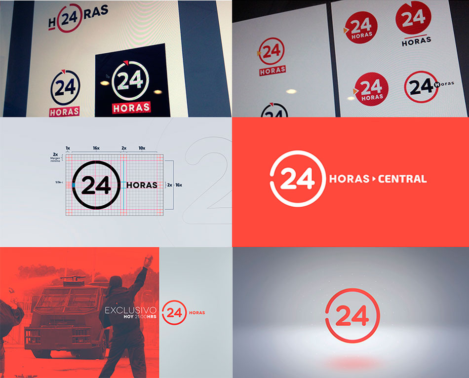
Luego de ver algunas piezas terminadas la interrogante fue ¿podríamos ser más drásticos en la renovación? se planteó un cambio rotundo, pasar del cuadrado a un circulo. Aunque en algún momento 24 horas tuvo un logo así, se buscó refinarlo, integrarlo a los nuevos medios y usar lenguajes visuales que se conectaran con las aplicaciones móviles actuales. El re diseño estuvo a cargo de Orlando Rubina, Director de Arte de todo este proceso y en general del cambio de lo que actualmente se ve en pantalla.
Channel 24 HORAS Rebrand
Genesis
The project began in mid-April 2015 with the question of how to improve the news. In the first instance, the change of the brand was raised, and as a result of that, a transition from the square logo with an inclination to a square one was generated. To visualize how it behaved is that I was commissioned to make a video ID with what would be the graphics line, more flat and orthogonal.
El proyecto inició a mediados de Abril del 2015 con la interrogante de ¿cómo mejorar el noticiero?. En primera instancia se planteó el cambio de la marca, y a raiz de eso es que se generó una transición del logo cuadrado con inclinación a uno cuadrado. Para visualizar cómo se comportaba es que se me encomendó realizar un video ID con lo que sería la línea gráfica, más flat y ortogonal.
Taking Risks
After seeing some finished pieces, the question was: could we be more drastic in the renovation? A resounding change was proposed, moving from the square to a circle. Although at some point 24 hours had a logo like that, we sought to refine it, integrate it into new media and use visual languages that will connect with current mobile applications. The design was in charge of Orlando Rubina, Art Director of this whole process and in general of the change of what is currently seen on the screen.
References
The search for references allowed us to know how and where to start working on visuals and animations.
La búsqueda de referencias permitió saber cómo y dónde empezar a trabajar en la visualidad y animaciones.

The Transformation
Having made the decision and having the approval of the press director, I was entrusted with carrying out the institutional, regional IDs and the three versions of the daily news.
Tomada la decisión y teniendo el visto bueno del director de prensa se me encomendó realizar los ID institucionales, regionales y las tres versiones de los noticiarios diarios.
Wipes
Then I was commissioned to make several versions that would separate the different audiovisual breaks required by directors and video editors.
Luego se me encomendó realizar varias versiones que separarían los distintos quiebres audiovisuales que requiriesen los directores y compaginadores.
Bumpers
Already with much of the identity taking shape the next step was to build continuities that would enhance the brand of the channel 24 hours. This particular piece helps to synchronize the open signal and 24-hour cable channel.
Ya con gran parte de la identidad tomando forma el siguiente paso fue armar continuidades que permitieran potenciar la marca del canal 24 horas. Esta pieza en concreto ayuda a sincronizar las emisiones de señal abierta y canal de cable 24 horas.
Programs
The most complicated part was the conceptual and animation gestation of each section. The challenge was that follow a coherent visual line, but that was not the same.
La parte más complicada fue la gestación conceptual y de animación de cada sección, el desafío era que siguieran una linea visual coherente pero que no fueran exactamente iguales.
The Team
Press Director Alberto Luengo
Graphic Editor Daniela Cartagena
Art Director Orlando Rubina
Viz Artist Designer Carolina Luan / Orlando Rubina
Viz Pilot Designer Alexis Alarcón / Cristián Espinoza
Motion Graphic Designer César Núñez Gladina